Saturday, February 19, 2011

illuminating object


i have no idea what i'm making for my illuminating object, but check out the picture i just took while prototyping!


Friday, February 18, 2011

Car Part Toothbrushes

BRIEF

Create a utopia and an artifact that exists in that utopia.

SUMMARY

My thesis teammate Nathalie Collins and I have been working on a thesis project related to the future of ridesharing and so have spent a lot of time thinking about transportation. In the utopia that we created, places are constantly shifting in a way that makes current forms of transportation obsolete.

Because we were envisioning a world where cars become obsolete very quickly, their parts need to be repurposed. I was interested in stretching the limits of what we think about as "acceptable" repurposing, so we created a set of toothbrushes made from old car parts. Below is a set of three brushes and a toothbrush holder.


Thursday, February 17, 2011

Open Silver Ring

SUMMARY

I created this silver ring as a project for my Design II art class. I wanted to experiment with creating an open ring and fluid forms because I love the subtlety of the ring creeping up on one side of the finger, as if to reach out to the other end, as well as the illusion that the ring could fall off at any moment.


PROCESS:

The ring was created using lost wax casting. I carved the ring by hand and sprued it to the tree below to be cast.


Wednesday, February 16, 2011

Pens in the Style of...

BRIEF

Design and produce two pens in the style of two different designers.

SUMMARY

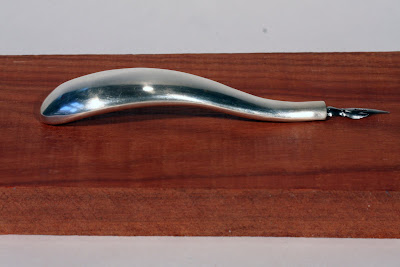
My two designers were Nambe, a cookware company based in New Mexico that makes handcrafted pieces from a special eight-metal alloy, and Shah Jahan, the architect of the Taj Mahal.

The Nambe pen borrowed the following elements of form: formed to fit the hand, simple, curved lines, hard edges, craft feel + precious material


The Shah Jahan pen borrowed the following elements of form: monumental & stand-alone, geometric (the pattern is related to the golden ratio), tapered, organic patterns, white color & matte finish.


PROCESS

The Nambe pen was cast in silver using the lost wax casting method.


The Taj Mahal pen was turned out of renshape on a wood lathe using a pen mandrel. The pattern was created using a Dremmel.

Personal Statements: Wordplay

BRIEF: Create something of meaning to you

SUMMARY: I have been intrigued by letterforms, the way we understand the meanings of words, and the connections between these things for awhile. I have also been interested in what it means to create an entire experience and control a space.
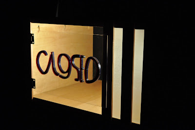
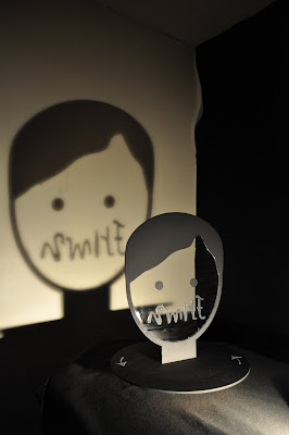
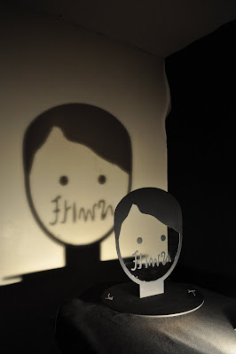
My personal statement explores letterforms manifested physically and have been created to read as opposites on each side. I see these as prototypes for large outdoor sculptures.

Pair 1: Open/Closed

This pairing was an iteration of an open/closed shadow sign I made last year (see previous post). The sign reads differently from each side. These letterforms are lasercammed out of acrylic and attached to a wooden cabinet.


Pair 2: Wet/Dry

This pairing was set up over a reflecting pool. Materials: Magnetic board, masonite, glass dish, stones, water, light.

Pair 3: Smile/Frown

This pairing is contained within a clear head that spins (lazy-susan style). The shadow on the wall reveals the words more clearly.

PROCESS: I created all the word pairs by hand, turning paper back and forth until letterforms matched up. I then scanned these words and converted them into Illustrator files to cut them out using a lasercamm.


Tuesday, June 15, 2010

Enter: The StackJack Water Filter

The last time I wrote was shortly after returning from Cambodia to do some needfinding with two of the other three members of my team, Albert and Danielle. The project we worked on as members of the Entrepreneurial Design for Extreme Affordability class was to design a water filter for rural schoolchildren in Cambodia. On our trip we met Sukha and his classmates, as well as other members of their families. They live in a village in rural Cambodia and have no running water.

Sukha and his classmates led us to our Point of View:

Carefree curious children at rural Cambodian schools need an educational and engaging way to provide themselves with clean drinking water so they can thrive and be examples of healthy behavior in their communities.

In Cambodia, untreated water and poor sanitation are the leading causes of 9.4 million cases of diarrhea per year, which leads to 10,000 deaths. Children are especially vulnerable: diarrheal disease kills 14 out of every 1000 children. Furthermore, 1.8 million Cambodian households lack access to clean water and sickness resulting from unclean water and poor sanitation costs Cambodian households 80 M in lost productivity and medical expenses each year. Our partner Hydrologic, a subsidiary of International Development Enterprises (IDE) Cambodia, aspires to become the leading distributor of effective and affordable hygiene and sanitation products in Cambodia.

My Extreme Team partnered with Hydrologic to develop a water purification system suitable for school use to complement Hydrologic’s Rabbit Water Filter Home line (so named because rabbits are seen as wise in Cambodia, despite their non-existence there!). It meets the need of providing an affordable and robust larger scale water filter for this particularly vulnerable and influential population.


Enter: The StackJack Rabbit Water Filter.
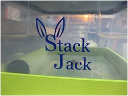

Our Functional Prototype, successfully tested with 2nd graders!


The StackJack filter has an innovative, low cost design featuring ceramic filtration technology -- the most effective water filtration technology widely available and locally producible in the Cambodian market. StackJack empowers children to provide themselves with clean water by lowering the access height for filter loading (with actual dimensions, not prototype dimensions) and increasing the ease of water transport. Its modular design also helps lifting because it decreases the volume of water carried per load and elicits the participation of multiple children loading together. The unique continuous flow element allows the holding volume of the filter to be scaled up or down for use in versatile settings, engages the senses when it is secured into place and the water starts to flow into the next module, and provides immediate feedback to the user. The StackJack water filter should be filled twice a day during the school’s morning and afternoon cleaning routines to provide 40L of filtered water per day. The attractive, modern design coupled with a reasonable price point make StackJack an ideal companion product for the Rabbit home filter.


Actual Piece Details:


Continuous Flow Mechanism Details:


Our Theory of Change (the big picture):

If rural schools have access to a community water filter, it will save families in the community money spent purifying water and treating the diseases that result from unpurified water, as well as improve children’s ability to study, socialize, and reach their education goals.

Additionally, we believe that children are agents of change in their communities and that they have the power and ability to change habits, creating a lasting behavior change and impact.

The presentation went wonderfully – it was really satisfying to see that the questions people asked us were about details of the filter, details that implied that they bought into the concept and were excited and thinking about the logistics of the installation and long-term maintenance of the StackJack filter.

Exit: Year 1 of Grad School.

A HUGE shout-out to the other members of my Extreme Team: Alexa Bisinger (MD/MBA 1), Danielle Garcia (GSB 1), and Albert Lai (MS, CS)!!

I arrived in Boston today to intern at IDEO this summer. Will do my best to update more often with summertime adventures!

Saturday, May 8, 2010

Open/Closed Shadow Sign

I realize how infrequently I've updated the projects on here -- I distinctly remember looking at the second year students' blogs last year and wondering why they stopped posting. And I guess the answer is just that blogs are hard to keep up!

This is an outdoor sculptural sign that I created for an Art class. It's a miniature model, but the basic idea is that when the sun shines from one direction, it reads "open" and when it shines from the other side, it reads "closed". Ideally it'd be optimized to read most clearly at the time a place opens and closes (and the hours would change as the days got longer).

Thursday, April 1, 2010

Needfinding in Cambodia

With the start of this quarter, I am attempting to restart my blog entries -- And so I am back from a week of "Needfinding" in Cambodia.

For one of my classes, "Entrepreneurial Design for Extreme Affordability", my 4-person interdisciplinary team (two MBA students, one CS, and me) has been tasked to design a water filter for schools in villages in rural Cambodia. We are working with IDE, a non-profit that has been successful in selling home water filters and wants to develop a version for schools.

When we arrived, we initially conducted a sneak-visit on a school that had been given a prototype a year and a half ago to find out if the product was still in use. We arrived to find that the filter was being used, although the tap was broken. They were collecting the clean water in a bucket below the filter. "Okay, so far so good." And then we discovered that all members of the class were sharing a single cup and dipping it into the bucket of water, recontaminating the clean water.
...


When we probed a little deeper, we discovered that though the 10-year olds could explain to us that their mothers boiled water for them to bring to school to kill the microbes that live in the water and could make them sick, they had no idea how diseases are spread. "If your mother is sick, can you get sick from her?" "No," all students replied. "If I drink out of this cup and give it to you, is it clean?" "Yes," they said. Students also reported never having seen their teachers or parents wash hands with soap. Schools reported having no money to purchase soap. The village chief reported not prioritizing sanitation because safety was a more pressing concern.

The problem is clearly one that is much wider than we initially anticipated. We went on to learn more general sanitation issues in rural areas. 70% of Cambodians defecate in the fields -- which seems strange until you realize that if you don't understand germ theory and water contamination, the fields seem far cleaner than a latrine. They tried the ad campaign "no toilet, no wife" (which rhymes in Khmer) one year, but the director at UNICEF laughingly explained, "The farmers just looked around and said, 'well I don't have a toilet, but I have a wife, so that can't possibly be true!'"


Our trip was also a lot about learning about the Cambodian people. Everybody we met, from the villagers to the staff at IDE to the Director of Sanitation at UNICEF was incredibly warm and funny. I came away with an incredibly positive view of the sunny Cambodian people. But there is a dark side, as Cambodia is a country that is healing. Just 30 years ago, a genocide ended that killed 1/4 of the population. All those perceived to be educated - doctors, teachers, government, people with glasses - were executed, leaving every person in the country affected. This is something that we found rarely spoken of -- the children do not even learn about it in their school curriculum. When mentioned, tears immediately came to the eyes of grown men we spoke to.

Part of what this nightmarish history means is that today's Cambodians are used to living in the moment and appreciating what they have today. As such, it is hard to convince people of the importance of long-term investments such as preventative health, especially when money is so scarce. Visiting the country and learning its history and the day-to-day challenges of its people has definitely invested our team in our project. I am excited to have the opportunity to work with IDE this quarter.

Thursday, March 11, 2010

Words of Wisdom - Courtesy of my Classes

Lessons that I want to remember and continue to strive towards from this quarter:

Courtesy of Art:
1. Design is the art form that is incomplete until it is engaged.

Courtesy of Improv:
1. Build on the ideas of others. Say "yes, and".
2. Make the other person look better than you.
3. Push yourself and cheerfully make mistakes.

Courtesy of Need-Finding:
1. Ask an open-ended question, listen, and pause for longer -- people always have more to say.
2. Look for disconnects between what people say and what they do.
3. All of our actions occur in the context of our cultural frames -- to understand the actions of another, we must try to understand their frame.
4. Stories and metaphors are incredibly powerful for communicating information.
5. Don't ignore discomfort. If you feel discomfort, either it means something is operating against your frame or it means something is operating against the other person's frame and you're picking up on it.

I'm waiting on the lessons from Extreme Affordability until next quarter.

Thursday, January 28, 2010

In Need of a Tow

as you may or may not know, i am shadowing tow truck drivers for a project... practicing empathy, understanding their needs, etc. it turns out constantin, my tow truck driver, has been awesomely fun to shadow.

so. this morning, i sit in my car to go pick up martini, start the engine of my car, and of course, the gods of comedy prevent my gear shift from working. i am trapped in my car, trying desperately to drive to the AAA tow truck man.

i eventually give up, run out, and ask my roommate if i can borrow her car. i start the car (thank god i can drive stick.... my psychic dad TOLD me i might need it one day for an emergency!). i get out of stanford, and at the light, the car dies. I start it up again and two lights later, it dies again. i eventually get to the tow truck company, and alas, my keys are stuck in the car! Twenty minutes later, and after soliciting the advice of four people, I discover that old saabs require you to have the gear in REVERSE (not neutral!) in order to take the keys out. wow.

i shadow constantin, we retrieve a car from an underground parking lot, an old classic car that had been crushed by a tree branch, and a frenchwoman's land rover. i learn about his life, the $200,000 cafe he lost overnight, how it put him in the depths of despair, and allowed him to come out with a wife and a new career that he loves. as we come back to the office so he can drop me off, i joke, "i hope my car starts." "i'll stay and make sure it does," he says back. sure enough, the battery's dead (i still have no idea why), and i end up needing a jump start. i drive out of the lot, and two lights later, the engine dies again. i cross my fingers, and it starts up. four blocks later, it dies one more time. i start it up again, and will my way home.

i walk back to my apartment by my car, sitting motionless and in need of a tow.

Sunday, January 17, 2010

Chiaroscuro

Well.... I have come to realize that much of what I'm working on this quarter will not be that visually appealing as that of last quarter. Except for art! As such, here is my first piece for Art 160, a chiaroscuro. I decided to go the charcoal route, rather than the photograph route and used a sculpture that was sitting in the loft as my subject.


Saturday, January 2, 2010

Monday, December 7, 2009

Kiwi Sketch

Pencil sketching was about practicing the process of sketching and seeing through repetition of sketches, as well as about learning about different pencil hardnesses.

I focused primarily on sketches of an orange. I primarily practiced replicating the shape with
accuracy and focuses less on the distribution of light. Citrus is particularly challenging because the thin membranes are very light and the large cellular structure contains most of the darker shades. As such, for my final sketch, I decided to start once again and use a kiwi. The bottom sketch is a close up of the area I boxed in the top one.


In this process, I learned a lot about emphasizing contrasts in shading to really pull your eyes
towards important details. I also started a lot of my final skech with a gray shade and then
darkened areas with the seeds and erased areas that needed to be lighter. This made the kiwi
significantly better than the oranges I had previously worked on.

Saturday, December 5, 2009

DP3: Inciting Behavior Change with Pirates!

Martini and I just finished our final design project of the year. It was a project about behavior change using smartphones, and she was great fun to work with! If you want to jump straight to the concept, watch the video:


We decided early on that we wanted to study people who considered themselves at risk for diabetes because we assumed they would be a highly-motivated group when it came to making positive lifestyle and behavior changes. After a few interviews, it became clear to us that unless an adult has a clear "trigger event" (i.e. getting diabetes or having a parent suffer significantly from the disease), he/she tends to do little to prevent the onset.

That said, we used our research to create concepts to be used at the grocery store because we felt that it was the only place where people really feel in control of their food choices. Some initial prototypes had to do with obtaining information on the "healthiness" of an individual at the point of purchase, giving away money to buy healthier foods, and daily goal-setting. Unfortunately, when taking our prototypes to the store for testing, we ran into several hurdles: people didn't want to carry a phone around with them as they shopped because they already had a cart, they were in a hurry to get out of the store, and they tend to buy the same things whenever they grocery shop.

We stepped back, tried to figure out what type of user wouldn't have all these constraints, and observed people in the store. That was when it hit us.... our user should be the kids of these people! They wander the stores aimlessly and are bored and are a great way to reach parents. So, we created a pirate treasure hunt iphone app for the store.


Sunday, November 29, 2009

First post on design + education

For many years I've said, "if I could learn everything through song, I would remember so much more than I do."

I watched a movie this morning about KIPP from Oprah a couple years ago as well as one on Teach for India, and it started me thinking.... At KIPP, students are taught multiplication tables by "rolling their numbers" (like the video shows). It is extraordinarily effective. When I think back to my own education, I remember almost every song or rhyme that taught me something traditionally taught through rote memorization (even ones from pre-school: "North America, South America, Auuussttrralliaa!") So here is my big "how might we" for the day:

How might we train teachers to use songs and music to teach fundamental skills and increase student investment?

One of the biggest challenges that low-income teachers face is that their students all come into the classroom with vastly different fundamental skills and knowledge. It is hard to teach a child algebra if he doesn't know his multiplication tables. What does KIPP do? They say, let's use music. Music impacts people across cultures and can be tailored to be culturally relevant. Music is repetitive and catchy. Music can be extremely effective in teaching fundamental skills.

I see two major areas to attack:

1) Information/resource dissemination: As a teacher, I acknowledged the power of song/rap/music in the classroom, but I had no idea how to leverage it. Some exceptional and/or musical teachers devote hours to perfecting rhymes to teach their kids, but it should not necessarily be a teacher's responsibility to come up with rhymes and tunes that already exist. Teachers should have access to music related to the fundamentals of any subject.

2) Training on how to use song in the classroom: So now I have a sheet with the lyrics to "Read, baby, read" sitting on my table. What do I do with it?? It is not enough to provide access to musical tools to teachers. It is also important to provide workshops to train teachers on how to best leverage these songs as a tool in their classrooms.

I guess this is the beginning of my brainstorm about thesis topics..... and s356 ideas!

p.s. thank you to all who have commented (it makes me happy to know when people read) :)


Monday, November 16, 2009

Art: Poster Design

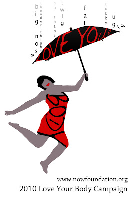
I decided to design for the “Love Your Body Campaign” Poster Contest. Before beginning, I sifted through posters online to find ones that I found especially effective. In particular, I found that I liked clear lines and the use of blocks of color, especially if the blocks of color are used to define the space and draw the eye to certain places. I preferred pictures without outlines and with simple color schemes. I particularly liked an old Bally poster and decided to play off this as inspiration for my own.

Another feature I liked was posters that played with words. I started to play with the letters BODY and soon found that they easily could be manipulated to evoke the shape of a woman’s body. I used this as the base for my poster.

I then determined what emotion I wanted to convey with my poster. The theme “Love Your Body” is about celebration – a celebration of the female shape, in all its forms. I wanted everything about the poster to convey this – the colors, the body shape, the text, the imagery. I started with the body shape… what is celebration about? It’s about dancing, hopping, and letting the limbs be free. As such, I looked for pictures of a woman jumping in the air as a base for my poster. I converted her body into blocks of color in photoshop (and added an arm), but the image still felt incomplete. There were two major issues: 1) It wasn’t explicit enough and 2) a lot of people were not noticing that “BODY” was used to form the shape of her body.

The feedback I received led me to figure out what was missing from the poster: what was she celebrating? She was celebrating a triumph over all of the negative forces related to body image that are out there. It appeared as though her hand could be holding something, so I decided to give her a “love your” umbrella to highlight “body” on the body. It also had a symbolic purpose – she could use it to shield her from “insult rain” filled with negative words describing bodies. I wanted her to hold it up in triumph, so I angled the umbrella a bit, so it feels as though she is triumphantly dancing through the rain with the umbrella as insults bounce off its edges.

Another key challenge I faced was figuring out how to make her look racially ambiguous, since this is a poster that should appeal to a wide variety of people. I combated this problem in two ways: 1) I used a “skin tone” that was not real, a warm gray, to give the girl the appearance of a silhouette and 2) I left off eyes and a nose, as mouths are more universal in shape than either eyes or noses. I’m generally happy with how the imagery turned out and plan to play with the font choice and text placement at the bottom a little more. Here's the final result:

Sunday, November 1, 2009

dp2- Teenagers and Collaboration

Our second design project was about leveraging technology to foster collaboration between 12-17 year olds (with a vision for 5-10 years in the future). We focused on 12-14 yr olds, a group that wants to be treated as adults or equals, but are still forming their identities. They spend the majority of the time with their family or those most accessible to them.

The design principles that we settled upon are as follows. We wanted our product to:
1) lower the barrier teens have to trying new things

2) empower teens to teach and learn from each other

3) assist in gaining life experiences to prove improve self-confidence and help build rapport with adults


This story walks you through a day of the life of a teen using our product system: Everywear

I wake up, shower, eat breakfast, and take my uniform shirt off its inductive charging hanger. I scroll through the default shirt images and choose my favorite one: Spongebob Squarepants. My shirt beeps to remind me that I have 5 minutes to leave in order to be on time for school.


My mom drops me off, and as I walk into the building, my attendance is automatically registered. My shirt glows green temporarily with the time 7:23 to indicate that I made it to school on time.

I get nervous as I notice the boy I have a crush on. As I walk near him, our shirts both switch to images of Ne-yo. I notice the picture and ask him if he heard about the concert on Friday. He says that his mom won’t let him go but that he really likes the new cd. Our shirts start to glow yellow and we realize that we’d better get to class before we’re late.


As I enter history class, my shirt glows green again to indicate that I am on time. The walls have been converted to images of Washington DC. I sit down at my interactive table with three other students and my section of the table automatically loads my customized workspace. The warm-up question says "Spend 5 minutes finding something that interests you about Washington DC to share with your peers." I love music and quickly find a Duke Ellington music clip to share with the class since he’s from DC. As I submit my warm-up response, it posts to the white board, next to other students’ clips of the

"I have a Dream" speech and written history on the Lincoln memorial. When the 5 minutes is up, 3 responses are randomly chosen to share with the class.

My teacher begins to present the class material, and pauses in 10 minutes. "Based on we just learned, which is not one of the key points made in MLK's "I have a dream" speech? We all input our answers, and teacher automatically receives the feedback that only 30% of us got the right answer. "Alright, class, we are not ready to move on, we need to spend 10 minutes on additional information about this topic. The 6 different ways you can learn more about this are now on your tables.”


I see on mine that I can watch the speech live, read a transcript of the speech, or watch a youtube re-mixed musical enactment of it, among my options. I decide to watch the musical. I am also interested in a

couple of the other options, so I drag them to the "save to

backpack" icon so I can look at them later. My teacher puts up another similar quiz question, and we are again given the opportunity to respond. This time 90% of us get the answer correct. "For those of you who understood the question this time, submit a way that helps you remember the answer." After class, she goes through the answers and submits one to a nationwide data library to be used for future classes. This registers a collaboration point for our school. The schools that receive the most collaboration points in the city receive money from the government and private sponsors to spend on events during the year, where we get to invite kids from nearby schools. Class ends, I go to my other morning classes, and then I head to lunch.

As I walk to sit down with my friends, I notice Melanie, someone I’ve seen in my classes, but don’t really know. As I approach Melanie, her shirt changes to say she wants to learn piano, so I suggest we meet after-school so that I can teach her and practice some new songs I’m working on at the after-school learning center. "That would be great!" says Melanie. Thanks! I leave to go sit with my friends.

During lunch, my friends start discussing new youtube videos. "Wait, did any of you see the viral video about the dancing mouse?" "No!" I scroll to the still frame of the video that I have uploaded as one of my default shirt images to show my friends. As lunch finishes, I return to class.

After school, I walk to the after-school learning center to work on homework and practice piano. I sit down at one of the collaboration tables, which instantly shows my homework assignments and I start to work on my math. I have a question and looks around to see what other people are working on, which is displayed on the walls behind them. One of the others is also working on my math assignment, so I write a quick digital note asking for help on question 13 and fling the note electronically to the other student. The other student walks over and helps me, which logs a collaboration point for him.
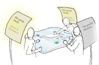
After finishing his math homework, I write a new note, explaining that Melanie and I are about to go practice piano to invite anybody else who's interested. I fling the note into a "pile" in the center of the table, which automatically displays it on the wall near me. When I teach new kids piano, I automatically gets individual collaboration points that will give me money to spend at stores that have joined the school's collaboration point program in exchange for advertising.


At the end of the day, my mom comes to pick me up and it's time for dinner. We go to Dionni's, my favorite pizza place, and I go in to pick up a pizza for the family. I pay for it with my collaboration points because Dionni's is a participating business partner in the collaboration project. As I’m paying for the pizza, the person working at the counter asks him if he'd like a free Dionni's picture upload for his shirt. "Yeah! I love Dionni’s!” The image I chose is attached to his account and now accessible to him when he goes home. I go home, hang my shirt back up for charging and upload the new Dion's picture as one of my new default images.

Saturday, October 17, 2009

Art 60 Project - 300 objects and 40 hours of my life

Step 1) Acquire and prime 300 objects
2) Mix colors and paint
3) Arrange and mount

Light to Dark

Warm to Cool

Desaturated to Saturated