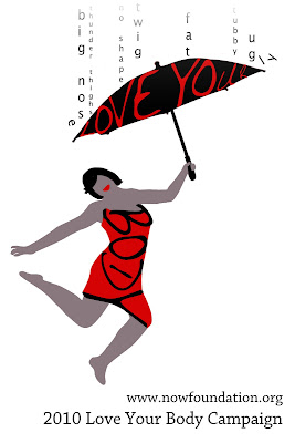
Another feature I liked was posters that played with words. I started to play with the letters BODY and soon found that they easily could be manipulated to evoke the shape of a woman’s body. I used this as the base for my poster.
I then determined what emotion I wanted to convey with my poster. The theme “Love Your Body” is about celebration – a celebration of the female shape, in all its forms. I wanted everything about the poster to convey this – the colors, the body shape, the text, the imagery. I started with the body shape… what is celebration about? It’s about dancing, hopping, and letting the limbs be free. As such, I looked for pictures of a woman jumping in the air as a base for my poster. I converted her body into blocks of color in photoshop (and added an arm), but the image still felt incomplete. There were two major issues: 1) It wasn’t explicit enough and 2) a lot of people were not noticing that “BODY” was used to form the shape of her body.
The feedback I received led me to figure out what was missing from the poster: what was she celebrating? She was celebrating a triumph over all of the negative forces related to body image that are out there. It appeared as though her hand could be holding something, so I decided to give her a “love your” umbrella to highlight “body” on the body. It also had a symbolic purpose – she could use it to shield her from “insult rain” filled with negative words describing bodies. I wanted her to hold it up in triumph, so I angled the umbrella a bit, so it feels as though she is triumphantly dancing through the rain with the umbrella as insults bounce off its edges.
Another key challenge I faced was figuring out how to make her look racially ambiguous, since this is a poster that should appeal to a wide variety of people. I combated this problem in two ways: 1) I used a “skin tone” that was not real, a warm gray, to give the girl the appearance of a silhouette and 2) I left off eyes and a nose, as mouths are more universal in shape than either eyes or noses. I’m generally happy with how the imagery turned out and plan to play with the font choice and text placement at the bottom a little more. Here's the final result:

Looks cool. On the image on the website it's hard to read the last 'r' in the umbrella, so it reads 'love you', but that works well too :)
ReplyDeleteLove the raining ideas and the movement! But don't you think she looks a little fat? Maybe if you decrease the text size of "Body" you could make her thinner.
ReplyDeleteI love this poster! I'm so amazed at what you're doing at d-school.
ReplyDeletejohn! is it john?
ReplyDeleteWow, nice and enchanting poster design. Good art work in it. Thanks for presenting it here. Now days posters are used for many purpose like advertisements, Announcements and even more. By the way I used to get good designed poster for my business from Posterninjas. They are doing such a worthy job on designing.
ReplyDelete