Monday, December 7, 2009

Kiwi Sketch

Pencil sketching was about practicing the process of sketching and seeing through repetition of sketches, as well as about learning about different pencil hardnesses.

I focused primarily on sketches of an orange. I primarily practiced replicating the shape with
accuracy and focuses less on the distribution of light. Citrus is particularly challenging because the thin membranes are very light and the large cellular structure contains most of the darker shades. As such, for my final sketch, I decided to start once again and use a kiwi. The bottom sketch is a close up of the area I boxed in the top one.


In this process, I learned a lot about emphasizing contrasts in shading to really pull your eyes
towards important details. I also started a lot of my final skech with a gray shade and then
darkened areas with the seeds and erased areas that needed to be lighter. This made the kiwi
significantly better than the oranges I had previously worked on.

Saturday, December 5, 2009

DP3: Inciting Behavior Change with Pirates!

Martini and I just finished our final design project of the year. It was a project about behavior change using smartphones, and she was great fun to work with! If you want to jump straight to the concept, watch the video:


We decided early on that we wanted to study people who considered themselves at risk for diabetes because we assumed they would be a highly-motivated group when it came to making positive lifestyle and behavior changes. After a few interviews, it became clear to us that unless an adult has a clear "trigger event" (i.e. getting diabetes or having a parent suffer significantly from the disease), he/she tends to do little to prevent the onset.

That said, we used our research to create concepts to be used at the grocery store because we felt that it was the only place where people really feel in control of their food choices. Some initial prototypes had to do with obtaining information on the "healthiness" of an individual at the point of purchase, giving away money to buy healthier foods, and daily goal-setting. Unfortunately, when taking our prototypes to the store for testing, we ran into several hurdles: people didn't want to carry a phone around with them as they shopped because they already had a cart, they were in a hurry to get out of the store, and they tend to buy the same things whenever they grocery shop.

We stepped back, tried to figure out what type of user wouldn't have all these constraints, and observed people in the store. That was when it hit us.... our user should be the kids of these people! They wander the stores aimlessly and are bored and are a great way to reach parents. So, we created a pirate treasure hunt iphone app for the store.


Sunday, November 29, 2009

First post on design + education

For many years I've said, "if I could learn everything through song, I would remember so much more than I do."

I watched a movie this morning about KIPP from Oprah a couple years ago as well as one on Teach for India, and it started me thinking.... At KIPP, students are taught multiplication tables by "rolling their numbers" (like the video shows). It is extraordinarily effective. When I think back to my own education, I remember almost every song or rhyme that taught me something traditionally taught through rote memorization (even ones from pre-school: "North America, South America, Auuussttrralliaa!") So here is my big "how might we" for the day:

How might we train teachers to use songs and music to teach fundamental skills and increase student investment?

One of the biggest challenges that low-income teachers face is that their students all come into the classroom with vastly different fundamental skills and knowledge. It is hard to teach a child algebra if he doesn't know his multiplication tables. What does KIPP do? They say, let's use music. Music impacts people across cultures and can be tailored to be culturally relevant. Music is repetitive and catchy. Music can be extremely effective in teaching fundamental skills.

I see two major areas to attack:

1) Information/resource dissemination: As a teacher, I acknowledged the power of song/rap/music in the classroom, but I had no idea how to leverage it. Some exceptional and/or musical teachers devote hours to perfecting rhymes to teach their kids, but it should not necessarily be a teacher's responsibility to come up with rhymes and tunes that already exist. Teachers should have access to music related to the fundamentals of any subject.

2) Training on how to use song in the classroom: So now I have a sheet with the lyrics to "Read, baby, read" sitting on my table. What do I do with it?? It is not enough to provide access to musical tools to teachers. It is also important to provide workshops to train teachers on how to best leverage these songs as a tool in their classrooms.

I guess this is the beginning of my brainstorm about thesis topics..... and s356 ideas!

p.s. thank you to all who have commented (it makes me happy to know when people read) :)


Monday, November 16, 2009

Art: Poster Design

I decided to design for the “Love Your Body Campaign” Poster Contest. Before beginning, I sifted through posters online to find ones that I found especially effective. In particular, I found that I liked clear lines and the use of blocks of color, especially if the blocks of color are used to define the space and draw the eye to certain places. I preferred pictures without outlines and with simple color schemes. I particularly liked an old Bally poster and decided to play off this as inspiration for my own.

Another feature I liked was posters that played with words. I started to play with the letters BODY and soon found that they easily could be manipulated to evoke the shape of a woman’s body. I used this as the base for my poster.

I then determined what emotion I wanted to convey with my poster. The theme “Love Your Body” is about celebration – a celebration of the female shape, in all its forms. I wanted everything about the poster to convey this – the colors, the body shape, the text, the imagery. I started with the body shape… what is celebration about? It’s about dancing, hopping, and letting the limbs be free. As such, I looked for pictures of a woman jumping in the air as a base for my poster. I converted her body into blocks of color in photoshop (and added an arm), but the image still felt incomplete. There were two major issues: 1) It wasn’t explicit enough and 2) a lot of people were not noticing that “BODY” was used to form the shape of her body.

The feedback I received led me to figure out what was missing from the poster: what was she celebrating? She was celebrating a triumph over all of the negative forces related to body image that are out there. It appeared as though her hand could be holding something, so I decided to give her a “love your” umbrella to highlight “body” on the body. It also had a symbolic purpose – she could use it to shield her from “insult rain” filled with negative words describing bodies. I wanted her to hold it up in triumph, so I angled the umbrella a bit, so it feels as though she is triumphantly dancing through the rain with the umbrella as insults bounce off its edges.

Another key challenge I faced was figuring out how to make her look racially ambiguous, since this is a poster that should appeal to a wide variety of people. I combated this problem in two ways: 1) I used a “skin tone” that was not real, a warm gray, to give the girl the appearance of a silhouette and 2) I left off eyes and a nose, as mouths are more universal in shape than either eyes or noses. I’m generally happy with how the imagery turned out and plan to play with the font choice and text placement at the bottom a little more. Here's the final result:


Sunday, November 1, 2009

dp2- Teenagers and Collaboration

Our second design project was about leveraging technology to foster collaboration between 12-17 year olds (with a vision for 5-10 years in the future). We focused on 12-14 yr olds, a group that wants to be treated as adults or equals, but are still forming their identities. They spend the majority of the time with their family or those most accessible to them.

The design principles that we settled upon are as follows. We wanted our product to:
1) lower the barrier teens have to trying new things

2) empower teens to teach and learn from each other

3) assist in gaining life experiences to prove improve self-confidence and help build rapport with adults


This story walks you through a day of the life of a teen using our product system: Everywear

I wake up, shower, eat breakfast, and take my uniform shirt off its inductive charging hanger. I scroll through the default shirt images and choose my favorite one: Spongebob Squarepants. My shirt beeps to remind me that I have 5 minutes to leave in order to be on time for school.


My mom drops me off, and as I walk into the building, my attendance is automatically registered. My shirt glows green temporarily with the time 7:23 to indicate that I made it to school on time.

I get nervous as I notice the boy I have a crush on. As I walk near him, our shirts both switch to images of Ne-yo. I notice the picture and ask him if he heard about the concert on Friday. He says that his mom won’t let him go but that he really likes the new cd. Our shirts start to glow yellow and we realize that we’d better get to class before we’re late.


As I enter history class, my shirt glows green again to indicate that I am on time. The walls have been converted to images of Washington DC. I sit down at my interactive table with three other students and my section of the table automatically loads my customized workspace. The warm-up question says "Spend 5 minutes finding something that interests you about Washington DC to share with your peers." I love music and quickly find a Duke Ellington music clip to share with the class since he’s from DC. As I submit my warm-up response, it posts to the white board, next to other students’ clips of the

"I have a Dream" speech and written history on the Lincoln memorial. When the 5 minutes is up, 3 responses are randomly chosen to share with the class.

My teacher begins to present the class material, and pauses in 10 minutes. "Based on we just learned, which is not one of the key points made in MLK's "I have a dream" speech? We all input our answers, and teacher automatically receives the feedback that only 30% of us got the right answer. "Alright, class, we are not ready to move on, we need to spend 10 minutes on additional information about this topic. The 6 different ways you can learn more about this are now on your tables.”


I see on mine that I can watch the speech live, read a transcript of the speech, or watch a youtube re-mixed musical enactment of it, among my options. I decide to watch the musical. I am also interested in a

couple of the other options, so I drag them to the "save to

backpack" icon so I can look at them later. My teacher puts up another similar quiz question, and we are again given the opportunity to respond. This time 90% of us get the answer correct. "For those of you who understood the question this time, submit a way that helps you remember the answer." After class, she goes through the answers and submits one to a nationwide data library to be used for future classes. This registers a collaboration point for our school. The schools that receive the most collaboration points in the city receive money from the government and private sponsors to spend on events during the year, where we get to invite kids from nearby schools. Class ends, I go to my other morning classes, and then I head to lunch.

As I walk to sit down with my friends, I notice Melanie, someone I’ve seen in my classes, but don’t really know. As I approach Melanie, her shirt changes to say she wants to learn piano, so I suggest we meet after-school so that I can teach her and practice some new songs I’m working on at the after-school learning center. "That would be great!" says Melanie. Thanks! I leave to go sit with my friends.

During lunch, my friends start discussing new youtube videos. "Wait, did any of you see the viral video about the dancing mouse?" "No!" I scroll to the still frame of the video that I have uploaded as one of my default shirt images to show my friends. As lunch finishes, I return to class.

After school, I walk to the after-school learning center to work on homework and practice piano. I sit down at one of the collaboration tables, which instantly shows my homework assignments and I start to work on my math. I have a question and looks around to see what other people are working on, which is displayed on the walls behind them. One of the others is also working on my math assignment, so I write a quick digital note asking for help on question 13 and fling the note electronically to the other student. The other student walks over and helps me, which logs a collaboration point for him.

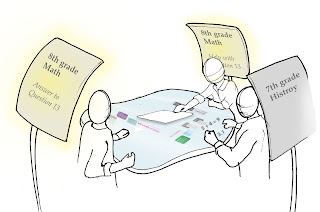
After finishing his math homework, I write a new note, explaining that Melanie and I are about to go practice piano to invite anybody else who's interested. I fling the note into a "pile" in the center of the table, which automatically displays it on the wall near me. When I teach new kids piano, I automatically gets individual collaboration points that will give me money to spend at stores that have joined the school's collaboration point program in exchange for advertising.


At the end of the day, my mom comes to pick me up and it's time for dinner. We go to Dionni's, my favorite pizza place, and I go in to pick up a pizza for the family. I pay for it with my collaboration points because Dionni's is a participating business partner in the collaboration project. As I’m paying for the pizza, the person working at the counter asks him if he'd like a free Dionni's picture upload for his shirt. "Yeah! I love Dionni’s!” The image I chose is attached to his account and now accessible to him when he goes home. I go home, hang my shirt back up for charging and upload the new Dion's picture as one of my new default images.

Saturday, October 17, 2009

Art 60 Project - 300 objects and 40 hours of my life

Step 1) Acquire and prime 300 objects
2) Mix colors and paint
3) Arrange and mount

Light to Dark

Warm to Cool

Desaturated to Saturated

Monday, October 12, 2009

Reflection 2: The Barbecube

Our first design project was to create a product to help four people carry everything they need to hold a barbeque (except the grill and at least half a mile over any type of terrain).

My initial reaction when watching the presentations was that it was incredible how differently such a seemingly-simple problem statement was interpreted by each group. Our solution, the “barbecube” came primarily out of interviewing about 25 people who were about 22-30 years old. We realized that this user group most enjoyed the socializing aspect of barbequing, least enjoyed the clean-up, often had trouble figuring out how to coordinate and remember to bring all necessary barbeque items, and had the least space in their apartments to store a lot of things. We focused primarily on how we could address these four things with our product and allow our user to truly carry everything he/she might need to enjoy a barbeque. I really enjoyed watching the groups who chose a different user group, primarily the one that chose to try to re-create the 50s picnic and the one that created a device for people who don’t generally barbeque. I learned from this process that it is incredibly important to have a clear user in mind and found the presentations of the groups who did so much more successful than those who didn’t. It helped direct the visions of the final products and gave them a story and a sense of direction.

Another important lesson was how important pacing is in these projects. If we had had more time, I think it would have been really wonderful to have gotten to create our cart-table to carry the cubes. One way that I think we could have created more time for ourselves would have been to conduct even more rapid prototypes. For example, we spent at least 4 hours putting together a Velcro latching system between each of the boxes that turned out to be completely unnecessary (and somewhat detrimental) to our overall design. We ultimately ended up removing all the excess Velcro, but a quick prototype of our carrying mechanism would have led us to this conclusion before we had invested the time in attempting it in the first place. I was impressed by how much information could be gathered through rapid-prototyping. In addition, having a suggested timeline was incredibly helpful in making sure that we finished all stages of the process in a timely manner. It makes me think that perhaps I should invest an hour crafting such a timeline for my 203 project in order to ensure that it gets done by the end of the quarter!


Monday, September 28, 2009

Orientation and Week 1 Photos

I am finally getting a few Week 1 photos up. The first couple are from our visit to David Kelley's house (founder of IDEO and the d. school at Stanford). The giant sand whale was one of our first design challenges and an important part of our fun-filled orientation week.


The following pictures are of the places that I will be spending all of my time for the next two years. The first is the Loft, still a work-in-progress, as the inside is still being built from scratch. The next is the lobby of the d. school and finally, one of the many awesome brainstorming spaces in the d. school. Very excited about the next two years :)

Reflection 1: Design-Thinking

My first week at Stanford was filled with this conversation:

me: Hi, my name is Anisha. What's yours?
someone: My name is _______________. What do you study?
me:

*pause*

my thought process: well, what do I say? The more accurate I make my answer, the more confused people become. I could take the simple route of saying "Mechanical Engineering", but the idea of sitting in a room doing problem sets for hours makes me queasy and is completely inaccurate. If I say "Product Design" people still want to know what department I'm in. I respond to that with Mechanical Engineering. Now the other person looks confused as images of slogging over problem sets and of those of designing a prettier red sofa seem to clash. I suppose I could most accurately respond with "Design Thinking", but that often leads to confusion about how I am getting a Masters degree without specialization in any particular topic. I find that people seem uneasy about the idea of specializing in being a generalist.

The design that I have come to Stanford to study draws from a huge variety of skills and fields including (but not limited to) problem solving, shop/building techniques, abstract creativity, leadership, engineering analysis and design, an understanding of technologies and tools that exist, business and entrepreneurship, sustainability and other social issues, aesthetics and formgiving, communication, human factors, and digital and media skills. I will spend the next two years learning as much as I can about all of these areas from my classes, projects, professors, peers, and extra-curricular activities.

I am here to learn a process that I can apply not only to making innovative products that solve problems, but also to use innovation to transform entire systems and organizations. Any problem or question that a company, person, or community regularly faces has the potential to be alleviated by investing the time to design a better solution. This program is about learning effective methods to do so. The more I learn about what design is and its potential applications to a variety of fields, the more excited I get about the doors it can potentially open and the type of work I may find myself doing in the future.

Unfortunately, this first week has left me perplexed about how to concisely explain my area of expertise and the multitude of applications for what I have come to school to study. I can't wait until this crystallizes.